- By Paul Jutton
- August 01, 2019
What's in a Logo?
2019 marks the tenth anniversary of the National Capital Planning Commission’s current logo. In early 2009 I, the agency’s graphic artist, was tasked to redesign the logo. At the time, NCPC did not have a strong public identity or brand. Experts say that a successful logo creates a recognizable and memorable image that effectively communicates an organization’s mission and activities, and the existing logo did not do this.
The Legacy of a Logo
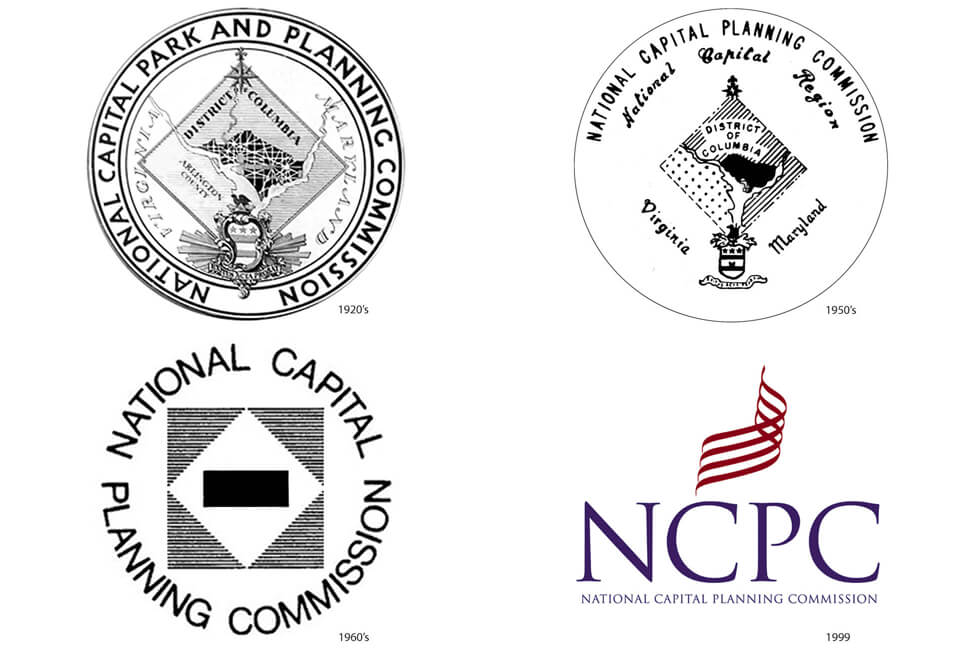
In the 1950’s, Congress enacted the National Capital Planning Act, which resulted in the agency incurring new responsibilities and a new name, dropping “park” from its official title. The logo was changed to reflect the new name, along with a few other changes including the look of the city design.
In the 1960’s, the logo was totally redesigned by NCPC Staff Director Bud Dutton. This new design, right out of Mad Men, featured a solid rectangle in a diamond, surrounded by a square. Variations of it were used up through the late 1990’s. Mary Fitch, former Director of Public Affairs said, “that logo was meant to show the city with the bar across the middle being the monumental core.”
In 1997, the agency released its signature plan Extending the Legacy, Planning America’s Capital for the 21st Century. This also marked the agency’s desire to invigorate its brand identity. To do this, the company that designed the plan also designed a new agency logo and font (Trajan) using the agency’s initials and name positioned beneath a flag-like symbol.
The Modern Redesign
Do not abbreviate the name.
However, the logo was never truly embraced. One issue was predominance of the NCPC initials, which could be for any number of organizations including the National Crime Prevention Council, the North Carolina Pork Council, or even the Northern California Pug Club. It seemed prudent that the new logo should spell out the agency’s name.
Former Office of Public Affairs Director Lisa MacSpadden noted that “how the Commission communicates its missions and key activities to the public is an important part of who we are and what we do. The abbreviated name as the focal point of our logo is likely to be meaningless to persons outside the National Capital Region.”
After reviewing and testing many typefaces, we gravitated to a san serif style for its contemporary feel. While Franklin Gothic was just one of the preferred fonts, we were pleasantly surprised to discover that this compact and cleanish font was designed in 1901 by Morris Benton of American Type Founders. This thematically coincided with year the Senate Park Commission released the McMillan Plan which guided efforts that created our present-day National Mall. The font was robust enough to keep its integrity when reduced in size and was easily adaptable to digital applications.
![]()
Even though the icon isn't an actual place, we wanted to pair it with the lettering; a visual point to anchor the text. In a nod to the original logo, we looked at the L’Enfant Plan’s street grid which created a unique and identifiable graphic. The resulting rectangles, squares, triangles, and circles became a visual shorthand of the DNA that underlies the city’s character.
Using these basic shapes, we took one more visual creative step using the horizontal, vertical, and diagonal “streets” from L’Enfant’s grid where each stroke conveys a meaning beyond the mark. The diagonal “aspires” upward to the word “National;” the even, stable horizontal directs the eye to the word “Planning;” and the downward diagonal is grounded to the word “Commission.” The circle represents not only the circles in L’Enfant’s Plan, but also the U.S. Capitol and Washington as the center of government.
Choosing appropriate colors
The official logo went through some rigorous debate regarding color. Red, white and blue was initially chosen because we’re a federal government agency. As the designer, I wanted to represent the external effects and placement of our work, not emphasis the source of it, so it became green and blue to allude to ground and water. Former Chairman John Cogbill stated, “the green speaks to what we are looking at as a city, in terms of LEED standards and environmental changes we are trying to implement in the District with our CapitalSpace Plan.”
Although an all-black or all-white version is commonly used for simplicity, the naming of our colors was also part of the project. Instead of Pantone 576, we chose “Reservation Green” for its distinction to the National Mall’s open space, and Pantone 654 became “Potomac Blue,” referencing one of the two rivers that surround our city.
The Result
The result is a very unique and highly identifiable logo that effectively symbolizes and communicates NCPC’s mission and activities. It’s not hard to figure out which agency the logo belongs to and the icon that reflects the unique street grid of the nation’s capital. So, to answer the original question, “what’s in a logo?” The answer is a lot of thought, discussion, reflection, research, and symbolism. Even though the current logo is now ten years old, I hope it will last for many more.